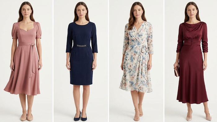
TRY THIS: Colors outside the palette for yourColor Season!
Discover which off-palette colors flatter each Color Season and how to wear them beautifully and effortlessly.

Knowing your Color Season helps you understand which tones make you glow — but that doesn’t mean you can’t wear colors outside your palette. The real magic happens when you learn which “rule-breaking” shades still harmonize with your natural coloring. Let’s explore all 12 Color Seasons and the unexpected hues that flatter each of them.
Bright Spring
Energetic and sparkling, Bright Spring thrives on light and clarity. Even outside your palette, vibrant tones work beautifully. Black can flatter if it has sheen or texture and is paired with coral or white. Electric blue, vivid magenta, and light champagne silver echo your natural brightness without dulling it.
Light Spring
Delicate and sunlit, Light Spring needs airy, luminous color. Instead of harsh black, try warm taupe or soft gray. Pastel lavenders and sky blues from cooler families can blend gracefully, especially when balanced with golden jewelry. A hint of icy blue feels fresh when mixed with peach or cream.
Warm (True) Spring
Golden and radiant, you shine with warmth and vivid hues. When you step outside your palette, look for grays with warmth or soft mushroom tones. Cool blues such as teal or deep turquoise harmonize well, and a pale metallic silver can work in small touches alongside warm accessories or makeup.
Light Summer
Soft, breezy, and pastel, Light Summer looks best in gentle cool shades. Off-palette neutrals like pale beige, light sand, or mist gray keep your look cohesive. Muted greens like sage or soft moss, powdery yellows, and pale rose gold metals can integrate smoothly into your wardrobe.
Cool (True) Summer
Refined and serene, your palette is built on balance and softness. Cool stone beige or muted camel pairs beautifully with rose or lavender. Olive-gray and matte pale gold add sophistication, while softened brick reds or warm corals create an interesting yet natural contrast.
Soft Summer
Subtle and misty, Soft Summer thrives on muted harmony. When exploring beyond your palette, reach for cocoa browns, gentle olives, dusty peach, or aged metallics. Stick to matte, desaturated versions — nothing too shiny or intense — to preserve your understated elegance.
Soft Autumn
Earthy yet muted, Soft Autumn glows in quiet richness. Warm grays, gentle taupes, blue-grays, and muted petrol blues blend beautifully. Rosewood, dusty mauve, and antique silver or light bronze metals keep your look balanced and sophisticated even outside your core shades.
Warm (True) Autumn
Golden, textured, and rich, True Autumn’s warmth is unmistakable. Deep navy and petrol blue lend contrast, while burgundy, wine, and warm gray-brown neutrals add luxury. Matte silver or slightly bronzed metals balance your gold-based tones with subtle coolness.
Deep Autumn
Intense and dramatic, Deep Autumn carries depth beautifully. Black works if combined with gold or terracotta accents. Inky navy, dark petrol, and warm charcoal make elegant neutrals. Wine, burgundy, and deep eggplant from cooler palettes can add sophisticated dimension.
Bright Winter
Sharp contrast and brilliance define you. Vibrant warm colors — coral, lemon yellow, or chartreuse — actually complement your intensity. Cool ivory, clear gray, and metallic champagne gold balance perfectly beside crisp whites and blacks, preserving your striking luminosity.
Cool (True) Winter
Pure, icy, and powerful, you shine in precision. Cool beige, frosty sand, cold cocoa, and teal bring variety without losing contrast. Deep burgundy or navy ink enrich your palette, while hints of polished gold can mix in if the rest of the look stays cool and crisp.
Deep Winter
Mysterious and elegant, Deep Winter is magnetic in dark, saturated tones. Espresso brown, deep olive, antique gold, and bronze blend easily with your signature blacks and navies. Even icy pastels like steel blue or cool pink add an intriguing layer of light among your depths.
How to Use These “Outside” Colors
Place them strategically: wear off-palette shades away from the face or pair them with your best hues near the neckline. Keep the essence of your season — brightness, softness, warmth, or cool contrast — and you’ll always look harmonious, even in colors that technically don’t belong to you.